Showing posts with label Visual Art Articles. Show all posts

April 3, 2018

The Color of Light

Authored By Christy Olsen.

When it comes to 'hue' or color, lighting is everything. Without some form of light, we cannot see color. When lighting conditions are low, we only see 'value,' the lightness or darkness of an object, not the 'hue' or color.

Color of Light

Whether it's yellow sunlight, blue light reflected from the sky, or orange candlelight, painters are always concerned with the 'hue' or color of the light.

Temperature of Light

Light temperature or 'chromaticity describes the 'hue' or color of the light (or as viewed on a neutral surface illuminated by the light), whether it's warm, cool, or something in between.

Light temperature is rated in Kelvin degrees, one of the seven base units in the International System of Units (SI), assigned the symbol 'K.' It can also be defined by using "XY" coordinates against a standard chromaticity scale determined by the International Commission on Illumination (CIE). Since 2012 all light bulb boxes are now required to tell consumers where the bulbs fall on the color spectrum, so selecting the bulb color/temperature is much easier.

Measuring the Color of Light

Not all white light is the same. The lower the Kelvin number, the 'warmer' or more yellow the light. The higher the Kelvin number is, the 'cooler' or bluer the light will be. White light bulbs are usually in the middle of the scale, measuring 3500K to 4100K. It's counter-intuitive, regardless of the light source, because photons themselves have no heat. Not what you would expect if you measured a boiling pot of water or the temperature outside.

Not all white light is the same.

Daylight Throughout the Day

Daylight experiences color shifts throughout the day. Direct sunlight at noontime is an almost perfectly balanced light source—it contains all colors in nearly equal quantities. The color appearance of objects changes dramatically in the early morning or shade.

The morning sun is a cool yellow; the noontime sun is a warmer yellow; the afternoon sun becomes reddish; the setting sun is orange and casts an orange glow on everything it illuminates.

Natural Light Changes Throughout the Day

Natural Light in the Studio

There's no substitute for natural light, and artists love to have it in the studio. North-facing windows are the preferred natural light source because these lighting conditions are the most consistent throughout the day. It allows them to get more work done using this natural lighting condition. If windows are east or west-facing, the light changes dramatically from morning until night. East-facing windows see the rising sun (cooler). West-facing windows see the sunset (warmer).

Too much light may be overwhelming and strain the eyes, especially if it is blasting on the white paper or canvas you are working on. You may need some blinds or curtains to control the amount of light coming in.

Quality of Light

CRI, or color rendering index, is a numerical scale (0 to 100) used in lighting to indicate how a light source will make the color of an object appear to the human eye. RI measures the quality of light and is independent of color hue/temperature.

The morning sun is a cool yellow; the noontime sun is a warmer yellow; the afternoon sun becomes reddish; the setting sun is orange and casts an orange glow on everything it illuminates.

CRI measures the quality of light

If you are looking to purchase lights to work with indoors, you need to determine your end goal before choosing which type of bulb. In many cases, this difference is not essential. However, for specific applications such as illuminating art or comparing fabric in retail clothing stores, CRI can make all the difference. If you have gallery representation, use the same light bulbs so that your representatives can see your work in the same lighting conditions.

The higher the CRI number, the better the color rendering ability, which reduces glare and will equate to sharper, crisper, and more naturally colored objects. Light sources with a CRI of 85 to 90 are considered good at color rendering. Light sources with a CRI of 90 or higher are excellent at color rendering and should be used for tasks requiring the most accurate color discrimination.
August 28, 2016

June 21, 2016

Visual Elements of Design

The "Visual Elements of Design," also known as the "Elements of Art," are essential building blocks to translate an idea or message into a visual concept, design, or composition. In visual arts, these elements can be found in drawing, painting, mixed media, photography, or any other two-dimensional (2D) visual communication methods, and the list depends on the source.

June 1, 2016

Writing an Artist Statement

Authored By Christy Olsen.

Every artist dreads the thought of writing an artist statement. Think about it. We are "visual artists," not literal ones! We would have been in literary arts if we wanted to write text! That said, whether you are self-represented or showing in multiple galleries. You still need an artist statement on your website to be a professional. 


Why? Anyone who looks at or buys your work may not be an artist themselves. They want to know in plain text or English what you are doing and why you are doing it. It also helps buyers or collectors articulate why they connect with your work, especially after they've bought a piece and are showing it off to their friends or family. 

Everyone has a different opinion on how to write an "Artist Statement" or what it should focus on. It can be just as subjective as your artwork. However, a good "Artist Statement" will connect or bridge the artist and their work to any audience, whether they like the artwork or not. 

It may be written in either the first or third person. Your statement should be clear, concise, and informative. Don't use too many big words; you will lose your audience or make them feel inadequate. It may be one sentence or three paragraphs, but limit the statement to half a page. 

Here's how to get started.

What does it all MEAN?

It's all about you and should be similar to your "Mission Statement."  A mission statement captures what you are doing right now, and a "Vision Statement" is what you want to do in the future or where you want to end up.

If you don't know your mission statement, you will have to flush it out! This is the most challenging part for most of us. It takes years to figure out for some, and it may be a moving target. Meaning that as we grow and change, so does our mission statement. 

You may get frustrated by this. However, first ask yourself, "Why am I doing what I'm doing?"  What does your artwork mean to you? Is there a specific subject or theme that you are drawn to? What is fundamentally driving you to create what you are creating? 

Remember, this is NOT about your technique or how you make artwork; this is WHY you are creating it in the first place.

Examples:  
  • I want to share the beauty of… 
  • My goal as an artist is to make pretty pictures… 
  • I create whimsical pieces to brighten up my day...
  • I abstract forms to make a balanced design... 

What's your INSPIRATION, SUBJECT, or THEME?

A good statement goes beyond the basics of what a single piece of artwork is all about. It will include a little about the artist, their creative inspiration, and their overall body of work. 

What about your subject or themes has inspired you to create, and what is it that you wish others to take away from your art? Beware, this may be tricky, or if you like to work in multiple genres like still life, portraits, landscapes, animal, abstract, etc. 

Examples:  
  • I love flowers because I played in the garden when I was little…
  • I love to paint landscapes because I want to be outside and carry on the traditions of "en plein air" or "in the open air"…
  • I paint horses because I own a ranch...
  • I paint abstracts because I love modern art...

What's your STYLE or MEDIUM?

Besides the meaning and inspiration, include your style and medium, especially if you work in a medium that enhances your style. 

Examples:  
  • I am a colorist who works in pastels. I love the vibrant colors it brings to my flowers… 
  • I am a surrealist who works in pastels because it allows me to make soft edges when I paint my dreams or fantasies...

Putting it ALL TOGETHER!

Now put all the components together (Meaning, inspiration, subject or theme, style, and medium).   

Examples:    
  • "I am a representational artist who paints florals from life in pastels. I played in the garden when I was little, and now I want to share the beauty of flowers with others. I paint flowers from life picked from my own garden, and I love the vibrant colors that the pastel medium brings to my work."
  • "I make balanced designs that put me at ease. I paint abstractly because I love the modern art era that began in the mid-twentieth century. I love to work in pastels because the square sticks help me produce the perfect geometric shapes I am drawn to." 

Am I Finished?

No, you are never done writing your artist statement.  Your statement will evolve as you and your artwork evolve. 

It will need to be tweaked or updated at least once every few years or even every six months, depending on how much artwork you produce. 

Some galleries even recommend that you should have one for each body of work or each genre. However, if you are getting into galleries, don't worry. They will ask you for exactly what they need because it will help them sell your work.

Lastly, always have a friend or neighbor proofread it to see if it actually connects the artwork with the audience and, of course, have them check for grammatical errors. If you need more help with writing or grammar, you can go to grammarly.com to check it, or you can even have a professional editor correct it for you for a small fee.


February 21, 2016

Why We Like Charcoal!

Authored By Christy Olsen.

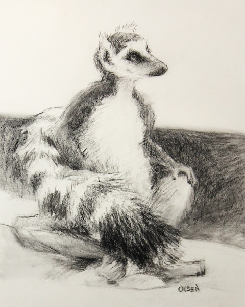
Charcoal is a dry drawing material used much in the same way as graphite, but it has a few advantages.

Charcoal, like graphite, varies in hardness and is also available in pencils or powder. Shading may be produced by smudging the marks made using a stump (made with cotton), tortillion (made from rolled paper), or even a Kleenex.

Carla. Charcoal on cream-toned paper. 18x24.

Advantages to Charcoal

Soft Edges

Charcoal is an excellent tool for getting those soft edges, atmospheric or sfumato (the Italian word for "to tone down" or "to evaporate like smoke") drawings like Leonardo da Vinci is known so well for.

Produces Intense Blacks

Charcoal produces a wide range of values, so it can create highly realistic and sensitive drawings. Vine charcoal makes lighter values, whereas compressed charcoal can create super intense blacks.

Work in Any Size

It is excellent for expressive drawing and can be used for more significant works. You just buy more giant chunks of charcoal.

Inexpensive

Vine charcoal is lightweight and inexpensive.

Less is More

It's hard to get stuck in details using charcoal because it has more of a blunt mark than the precision of a pencil. However, it can also be sharpened for finer details.

Works Great on Textured Paper

When buying paper in the art store, look on the label for "charcoal paper" or feel the texture with your hand. If it has a textured surface called the "tooth" of the paper, it will work great with charcoal. The "tooth" allows the paper to hold the tiny particles of the charcoal so that it adheres to the surface better. Note that the amount of texture or "tooth" varies among brands, so you will have to experiment to find what you like.

Nitram Fusains HB Charcoal

Nitram Fusains

This medium soft charcoal is the one most preferred for drawing and sketching. Nitram HB's superior hold is perfect for homogenizing tones and retaining tonal detail. Each package contains five batons, each measuring &frac14" square × 6" long. (5 mm × 152 mm). Read more about it at Nitramcharcoal.com.


Why I Like It?

I am a huge fan because it's easy to use, low maintenance, and low cost. It's natural, simple, has a wide range of values, and I can use my fingers as an eraser. I am picky about the type of charcoal that I use because I like to sketch with a sharp point.

The only charcoal I have found on the market that is strong enough to hold a good sharp point like a pencil, and dusty sufficient for me to erase with my fingers is Nitram Académie Fusains HB (Medium). It's wonderful!

I sharpen a point using a flat piece of sandpaper, put the charcoal in a brass charcoal holder, and then use it just like a pencil plus, I get the same luscious effects and qualities that I love about this beautiful drawing medium.

April 6, 2015

Shape Hunting

Authored By Christy Olsen.

Working from general to specific is an excellent approach to representational painting. It will help you stay focused on larger shapes to get the proportions accurate first and map out the value relationships before you hone in on the details.

Using a large brush at the beginning of your painting will help you see the bigger picture and help you avoid getting bogged down in those details. Note this is also why we love charcoal. It keeps us focused on the more oversized shapes, such as the eye versus the eyelashes.


North Light Window
North Light Window. Oil on board. 8x10.

Painting from life is the best! You will have to work harder to translate what you see from a three-dimensional world onto a two-dimensional canvas; however, it's worth it in the long run. The first step is what I call "shape hunting," and it's counter-intuitive because we humans have the remarkable ability to perceive depth.

To paint, we have to translate 3D objects into 2D objects. We are seeing to capture them with a brush. This is a very different concept from creating a contour drawing. You must mentally "flatten" out each object you see with your own eyes to mass in that unique shape with your brush. Pretend you are seeing a cross-section of each object and go for those larger shapes to get started and try not to get overwhelmed on the first pass.

Humans and primates can judge depth because we see with something called "binocular vision," i.e., two eyes merge each image within the brain. Monocular vision is when both eyes are used separately, so the field of view is increased, but depth perception is limited (i.e., eyes usually positioned on opposite sides of the animal's head like a horse).

This is great if you are driving a car. You know exactly when to stop before smashing into something. However, this works against you when trying to translate something from real life (i.e., a three-dimensional world) onto a two-dimensional (2-D) surface. Closing one eye is helpful for beginners. This gives us the monocular vision needed to flatten out the image. This is where good drawing skills come in handy for the more advanced, especially your perspective drawing skills.

For some of us, we do not always have the luxury of working from life, so we have to use photography. The downside of photography is that the color is almost always incorrect. The upside to photography is that it does an excellent job of translating objects into those flat 2-D shapes for us. The work is already done because the camera only has one lens, i.e., monocular vision. So if you have to rely on reference photography, do some color studies on-site with your own eyes to record the correct color. Some more advanced artists may play with the images in Photoshop to correct the color deficiency based on their own experiences of painting from life.

Go "shape hunting" at the beginning of your painting, and you will have more success later on as the piece progresses. Block in or mass in those larger flat shapes first. Afterward, you can always render, model, or blend it further. Blend more for a realistic or photographic look or leave objects less rendered for a more painterly look. 

April 3, 2015

Limited Palette Experiment

Authored By Christy Olsen.

Sometimes, if you experiment on a painting at home and it goes terribly wrong, it may discourage you. In the beginning, when you are trying to learn a skill, that's not necessarily what you want. The great thing about experimenting during a class or a workshop is supervision, i.e. there is a "safety net," so if you find yourself having a meltdown using that new color you just purchased at the art supply store, help is on the way!

When I take a painting workshop or a class, I learn from experience to challenge myself. I push myself outside of my comfort zone. That's it. I try to fail on purpose! I know it sounds crazy, but it also gets rid of those high expectations that you might have. If you try to experiment, you will get more from experience in the long run. The teacher is there to help and may have insight into what went wrong or great advice on a path forward.

Study by Christy Olsen
Still Life Study. oil on board. 12x16.

This study was done in a workshop early this year. I noticed during the demo that the artist only used a few selected colors from the multiple ones that were laid out, so when I went to paint my own, I used a limited palette. I wanted to see what would happen, and here is the result.

I used Rembrandt's Transparent Oxide Red, Holbein's Indigo, and Permalba White. I know using a limited palette can create harmony in your painting but somehow, seeing the concept happen in real-time before my eyes in that particular environment really resonated with me. It also made things much easier. I didn't have to worry about complex color mixing and noticed that I could then focus more on each brush stroke.

Study by Christy Olsen
Detail from Still Life Study. oil on board. 12x16.

Studies that I do in workshops are my class notes; each time I review them years later, I remember the epiphanies that I had at the time. There are some drawing issues with the symmetry of the pot on this one, but I left it alone to preserve the fantastic lesson that I learned at that particular moment in time.

The close-up detail shows the brushwork on the bottle that made me want to perverse the lesson without the overly rendered look.

March 28, 2015

Why Learn to Draw in the Digital Age?

Authored By Christy Olsen.

We are bombarded with images from morning until night via the internet, television, advertisements, and newspapers. As we move into the 21st century, our world becomes more and more driven by visual images. Drawing is a much-needed skill in the world of today and tomorrow.

Drawing is a compelling form of communication! Visual language and the visual arts are now more relevant than ever, and drawing is becoming necessary. A single drawing can communicate an idea, your imagination, a memory, a feeling, or a belief.


Charcoal heightened with white chalk on ivory paper. 8x8.

During the Renaissance, artists, engineers, and architects were in the same profession. The great draftsman was deemed omnipotent supreme because they possessed a unique skill to carry out or implement their own vision. Hatched from an idea on paper into full-blown reality, the great Duomo on the Florence cathedral was built and spawned the Renaissance.

"All of the work of the hand is rooted in thinking." — Martin Heidegger.

Drawing can be used to record, create, design, invent, experiment, organize, clarify, or even learn something new. Think about it, everything in the man-made world came from some type of drawing or blueprint.

Drawing is an amazing process itself that connects us to the outside world. It requires orchestrating multiple brain mechanisms, including observation, planning, processing, visual and spatial intelligence, emotion, motor skills, and personally expressive mark-making.


Preliminary Sketch for Larger Painting. Graphite on paper. 5x7.

"The older I become, the more I realize that drawing is the most important of all the problems of picture making." — Joaquin Sorolla


Drawing is the basis of science, engineering, architecture, geometry, mathematics, painting, sculpture, design, and cinematography. It gives you the ability and skills...

  • To conceptualize an object in your mind, then translate it to your hand 
  • Sharpen your mind and directly improve your ability to solve problems 
  • Study an object from life and absorb the information 
  • Create plans, blueprints, or designs

"Drawing remains one of the most immediate means for analyzing, interpreting and imagining our world." —Juliette Aristides.

Using the timeless visual language of drawing, you can convey an idea quickly and efficiently to anyone regardless of their own verbal language. Drawing is essential for engineers, designers, architects, scientists, and doctors and is vital to representational artists.

January 3, 2014

Blue & Orange, What a Combo!

Authored By Christy Olsen.

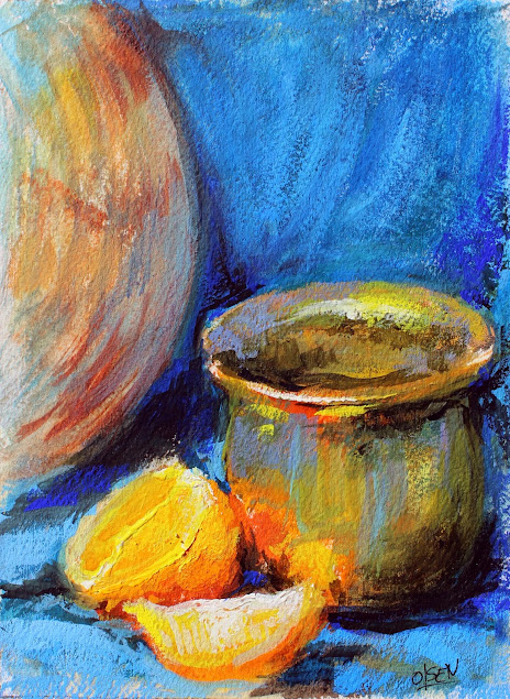
Blue and orange are such a great combination. They are complementary colors, meaning they are opposite on the color wheel. When mixed, they will cancel each other out and produce a neutral.

Without contamination, i.e., straight out of the tube, placed next to each other, they produce a strong, vibrant appearance. This color intensity also creates color harmony.

Painting by Christy Olsen
Oranges with pot. goauche. 5x7.